In-App Help was last updated in 8.6.4 (released 10/23/2019) if you are looking for help with a feature that has been added or enhanced since 8.6.4, please check in Online Help from Help menu.
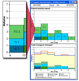
There are two Demand graphs on the Caregiver Intensity window: Patient Activity Impact and Total Caregiver Demand. The data between these graphs is interrelated, and the graphs share the same scale for the x-axis (Hour of Day).
The following illustration shows the Caregiver Intensity Impact window. The inset shows that between the hours of 09:00 and 10:00 there was a total demand volume of four related to patient activity: one admission event, one transfer in event, and two transfer out events.

If your organization uses the optional Outcomes-Driven Acuity application, there are two additional graphs: Demand-based Acuity Analysis and Average Acuity Level. These graphs are interrelated with the Demand graphs and share the Hour of Day scale, as shown in the following illustration.
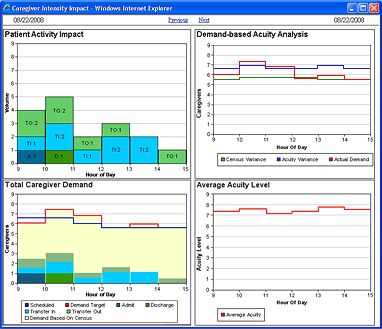
The Patient Activity Impact graph depicts patient activity volume. The vertical Volume axis (y-axis) represents the volume of admission, discharge, and transfer events. The horizontal Hour of Day axis (x-axis) displays six hours around the time clicked on the expanded utilization bar: the three hours before and after.
Each colored vertical bar on the graph represents the volume of admission, discharge, and transfer events occurring between the defined hours. In the preceding example, there was one admission, one transfer in, and two transfers out between the hours 0900 and 1000.
The types of patient activity are identified using color and the following abbreviations.
Note: The Patient Activity Impact graph displays workload for transfers between facilities a bit differently. If the transfer is from one preliminary unit to another, such between Emergency Rooms in two different facilities, the window displays the transfer as an admission due to the extra workload needed. If the transfer is between inpatient units, the window displays a TO (transfer out) for the original facility and a TI (transfer in) for the receiving facility. See Understanding Patient Transfers Across Facilities for more information.
This graph identifies the impact acuity, patient activity, and census have on demand for caregivers.
The green Census Variance line displays what caregiver demand would be using the budgeted census and the ratios associated with the actual average acuity by hour. (The budgeted census value is stored by effective date in the Budget Volume box of the Staff Manager Client Budget Data dialog box.) Compare the green line to the red Actual Demand line to determine whether the demand for caregivers is more closely associated with census rather than acuity or patient activity or both.
The blue Acuity Variance line displays what caregiver demand would be using the actual census and the ratios associated with the default acuity level for each selected location. Compare the blue line to the red Actual Demand line to determine whether the demand for caregivers is more closely associated with acuity or patient activity rather than census.
The red Actual Demand line displays the demand for caregivers based on actual census, actual average patient acuity, and patient activity. The red line on this graph matches the red Demand Target line on the Target/Schedule graph for the selected skills and time.
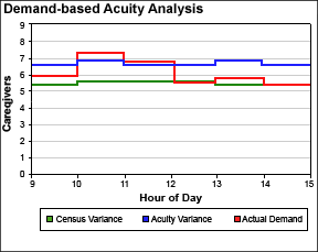
In the preceding illustration, the Demand-Based Acuity Analysis graph displays an analysis of variance due to census versus acuity. The red line displays Target staffing of 6.0 at 0900. The green line indicates that staffing using the budgeted census and actual acuity at 0900 are 5.2. The need for caregivers is impacted by either a higher actual census or patient activity. The blue line displays that staffing would be 6.8 at 0900, based on actual census and default acuity. The difference in the number of caregivers is due to actual average acuity being lower than default acuity.
In this graph, the Caregivers vertical axis displays the number of caregivers. The horizontal axis again displays activity for the three hours before and after the time clicked on the expanded utilization bar.
The impact the existing census has on caregiver demand is graphed in yellow. The impact on caregivers for each of the four types of ADT events is depicted in the same colors as the Patient Activity Graph.
The scheduled number of caregivers for the selected time interval is graphed in blue, and the total caregiver target demand in red. The total caregiver target demand is the sum of demand generated from the patients on the unit plus each event.
Keep in mind that the impact on caregivers based on patient activity is dependent on the type or types of activity and the exact time of the event. For example, if a patient is discharged at 15:22 and there is one hour of 1:1 demand associated with a discharge, then the impact on caregiver demand begins at 14:22 and end at 15:22. The caregiver impact for discharges and transfers out ends at the time of the event. The caregiver impact begins at the time of the event for admissions and transfers in. The amount of time added for admissions, discharges and transfers in and out are set by profile and may be changed by your Cerner Corporation Implementation Consultant or Client Support personnel.
In rare situations when the Registration application is down, the Patient Activity graph may display no ADT events, while the Total Caregiver Demand graph displays increased volume due to patient activity. This is due to a temporary discrepancy where Staff Manager is not receiving ADT events but has projected departures that increase caregiver demand. Once the ADT transactions catch up, the Total Caregiver Demand graph corrects itself.
The Average Acuity Level graph displays the average acuity level in the selected profile/location by hour of day. As the average acuity level changes over time, the graph updates to show the new value. In the preceding example, the average acuity level at 0900 is 7.25. See Acuity Targets and Average Acuity Calculations in Reports for more information about how the Average Acuity Level is calculated.
A patient is admitted to 6N MedSurg at 9:35 a.m. The Patient Activity graph registers the admission as one event taking place between 9:00 a.m. and 10:00 a.m.

An admission has a demand value of 1.0, meaning it requires one hour's worth of time from one caregiver. Since this admission took place at 9:35 a.m., part of that demand took place during the 9:00 a.m. hour and the rest during the 10:00 a.m. hour. The Total Caregiver Demand graph displays the proportional demand requirements during each hour.
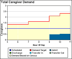
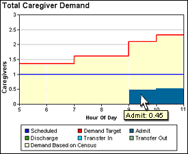
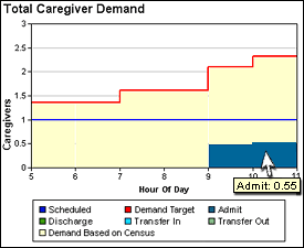
Positioning your pointer over each Admit column in the chart displays the exact caregiver demand required in each hour.
|
|
In the preceding illustrations we see an Admit demand value of 0.45 and 0.55, which together add up to the demand of 1.00 for the 9:35 a.m. admission.